
Are you a photography perfectionist? Do you know how much focus and editing a single image needs to stand out to be a perfect one?
An expert and experienced photographer knows how to make their captured images stand out using different techniques of editing with different features and specifications.
Color contrast is one of those features which helps in adjusting the color data of any image. It is the most basic feature which is necessary while editing any image. Let’s explore more about Color contrast and the easy-to-use techniques that might enhance the editing of your captured image.
What is Color Contrast?
A photograph can be captured or processed in various kinds of image formats. RAW, jpeg, gif, png, etc are some of those formats. RAW images or files are unprocessed and unedited files that are more detailed as compared to other formats such as jpeg in respect of color data and dynamic range.
These files require proper editing using some adjustment features. The basic adjustment features for any image are:
- Brightness
- Color contrast
- Sharpness
- White light
- Saturation
- Exposure
- Highlight
- Tone & color temperature
Color contrast is one of these adjustment features. This feature adjusts the contrast of the image.
Uses of Color contrast

The word contrast means difference or distinction. By definition, Color contrast means using warm colors with the cold colors in any image. Color contrast is the basic adjustment that enhances the color data quality of any image.
It shows the difference between the warm colors and the cold colors in any image.
The key use of contrast colors is to grab the viewers’ attention and take it towards the image subject. This makes your subject stand out.
Simple easy techniques of using Color contrast in photography
You don’t have to be a master of using color contrast or its techniques. You just need some smart striking tricks of using this technique to make people go wow!! So here we go.
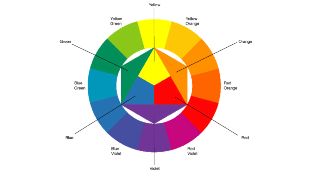
Complementary colors
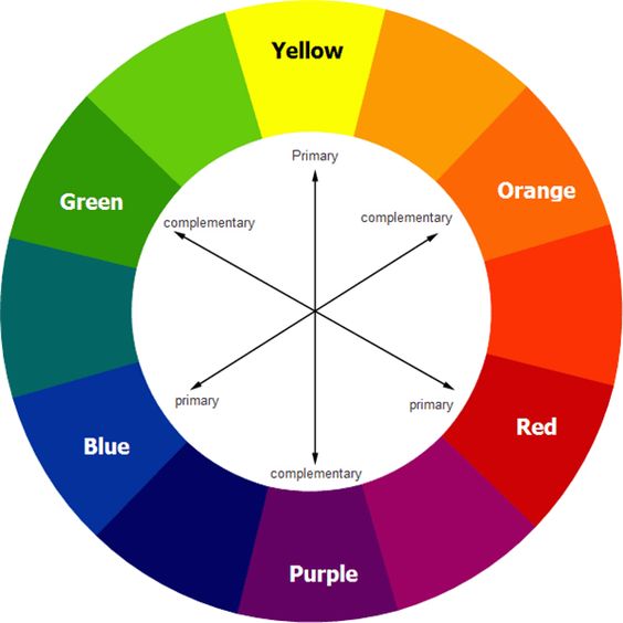
The best technique of using color in contrast in any image is using complementary colors. The complementary colors are those which are placed opposite to each other on the color wheel.
Using complementary colors in pairs makes striking color contrast and gives a good impact on your image.
Images with two bold colors
When you use colors in contrast or complementary colors in pairs, use just two bold and bright colors that stand opposite to each other on the color wheel.
Let’s say an object with a bright color accompanied by a solid and bold background. This creates an amazing impact.
Warm colors with cold colors
Colors such as red, black, orange, etc show warmer hues. And blue, white, green, etc show colder hues. Using them in pairs creates a sparkling contrast.
Post-processing enhancement
Use any photo editor software to adjust the color contrast of the image after processing.
These are some of the basic techniques of the color contrast you must know.
![]()
